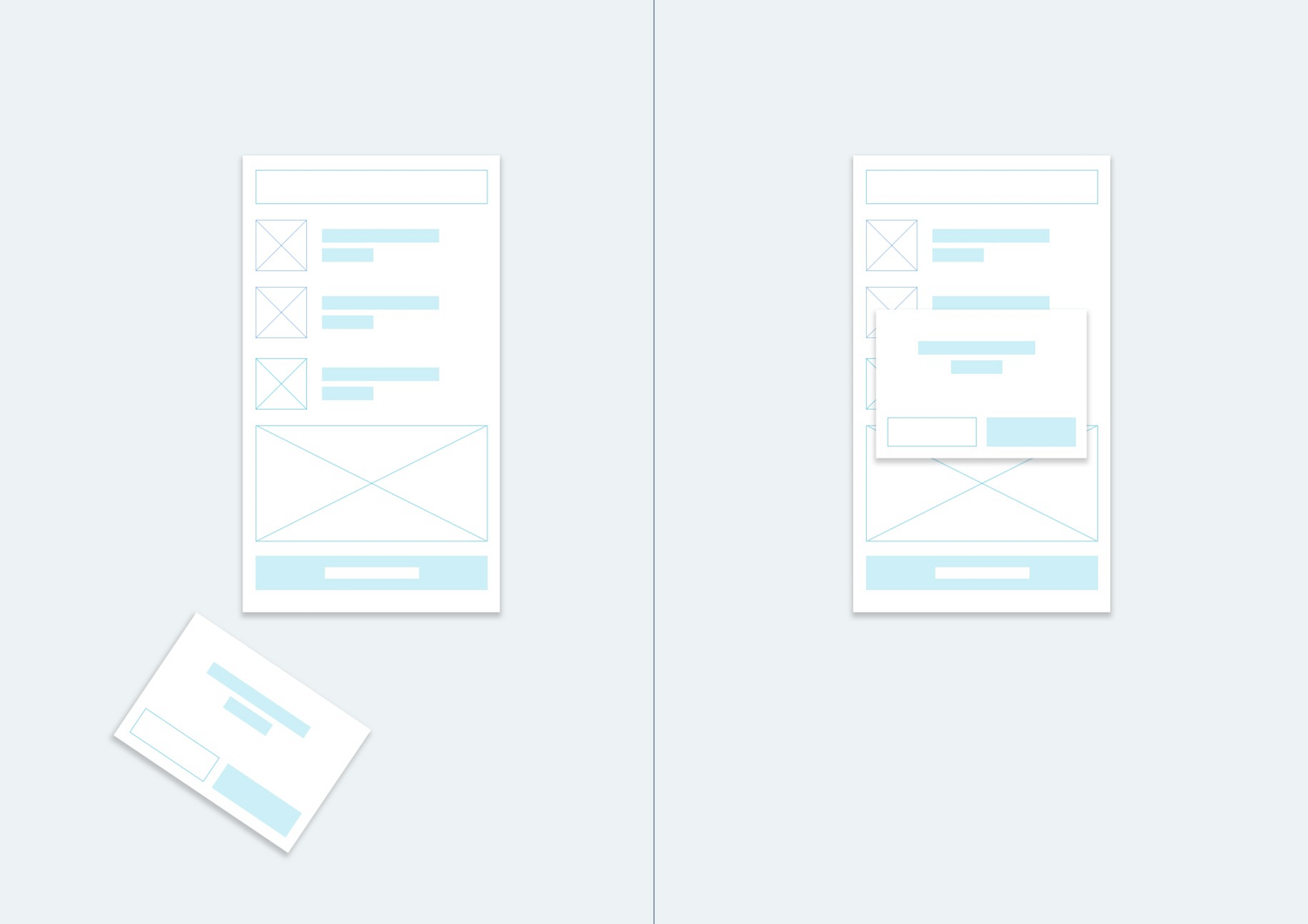
Prototyping in design is making waves. With the advent of different app designs, its really important to do it to get to the right flow of things.
Wireframing, as it it sometimes called, has always been an integral part in developing apps. It has become the standard in designing almost everything. It is the first step, the key to it all, the stuff that will make things right. In the early design phase of a project, it is a good shield against making mistakes throughout the entire process of a project.
Architects, designers and craftsmen have used prototyping for ever. It is a very good practice that designers should comply with. It will make the process of developing apps easier. It is also a discipline that needs to be observed and harnessed, despite sometimes seeming like too much work.
"Do I really need a prototype? Can’t I just describe my app idea? Why is a prototype a necessary step when scoping a project?”
Clients ask these sorts of questions daily. But they hardly ever "get" the scope until they "see" it. According to research, more than 65% of the world’s population are visual learners. The use of a visual aid will help others process and understand your app idea.
The quality of your prototype will depend on your audience. Are you building an internal prototype that only your team members will see? Are you ready to start user testing? Do you need to pitch your app idea to raise funds? The level of fidelity is entirely dependent on who will be interacting with the prototype and for what purpose.
There are 3 types of prototypes: Low-fidelity (hand drawn sketch), Medium-fidelity (bare bones wireframe), and High-fidelity prototype.
Low-fidelity Prototype
It is for internal use, a hand-drawn wireframe is a great place to start. Quick iterations on the design will allow designers to gain valuable feedback from clients early on in the design process.
What matters is that the creative team have a solid understanding of the app’s functionality and how a user will interact with the app. As the project evolves, developers can add more detail, fill in with real data, and eventually make the prototype functional.
Medium-fidelity Prototype
Practicality and usability of the prototype is the designer's main focus here. While the visual design begins to come into play more at this stage, the validation of the app's function is the focal point of user testing.
Putting visual elements but minimal design is perfect as Medium-fidelity prototypes. This is also the where people internally can give more detailed feedback on the functionality and usability of the project.
High-fidelity Prototype
This is the more polished presentation.
A high-fidelity prototype will be a far more professional version than a hand-drawn sketch.
A high-fidelity app doesn’t mean that you have to have every screen prepared. Focus on the most important screens within the app, like user logins and or creating profiles, and the look of the app icon.
Focusing on these key elements will help you provide a clear overview of the app while still allowing for further development.


Comments
blog comments powered by Disqus